Pavement Pushers:
Punk-Rock Zine
Pavement Pushers is an illustrated zine that incorporates a black-and-white punk style or aesthetic. My long-distance runs around Philly, along with the ’90s riot girl style inspire the zine. The character in the story faces many running problems like cracked sidewalks and crazy animals. I used gritty textures and brushes to make the illustration style more punk. I also created a typeface with a sharp handwritten style. Additionally, I created products and merch that align with the punk branding.
Sketches of the character, story, and items. I changed the character style to be more ‘quirky’ and cartoonish. The item sketches allowed me to find the right style and icons.
The video shows a flip-through of the physical zine I made. I used a laser print with slightly glossy paper. I also added the post-punk song “Getting Nowhere Fast” by Girls at Our Best!, because I think it embodies the theme of the story.
I created a typeface using the program Calligrapher to use throughout the story.
I wanted thick, textured, and bold lines. I also made the letters very angular and sharp which resonates with punk typography (often used on merch). The typeface has a bolder and regular version; I alternated using both versions throughout the zine.
The book cover process incorporated a lot of psychical elements that I scanned in.
I created the shoe print by dipping my actual shoe in black ink and slamming it on a piece of paper. I then scanned the shoe print in and changed the sole to match more of a running shoe. Additionally, I hand-drew the title type many times in my sketchbook before choosing one drawing. Then, I image traced it and altered it in Illustrator.
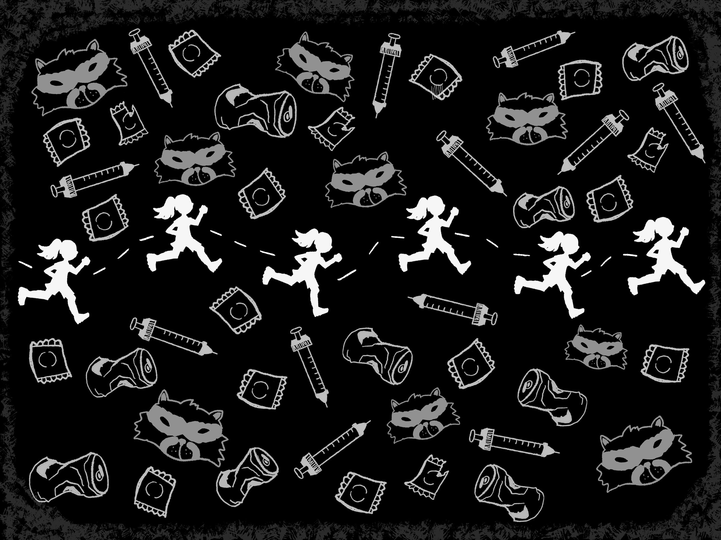
The endpapers to the zine. It shows the character running through all the trash. The trash includes common Philly objects such as dirty needles, crushed beer cans, and ripped condoms.
The map that shows the character’s running route and also serves as a table of contents for the story.
For the spread to the right I hand-wrote the type in a graffiti style.
The left spread is common things to avoid on a run. It was one of the first spreads I finished and it helped me construct the story.
The book starts and ends with the character in their room. The room is a culmination of the character’s punk and running interests. The posters in the background have riot girl, punk-rock, and emo bands. The floor has athletic wear and a water bottle.
The left spread shows gross, dirty running shoes. The right spread has the character running away from a crazy, aggressive dog. I used screen tones and crosshatching to create shadows and the punk style.
The spread above is the character avoiding a squirrel and then almost breaking their ankle. I used motion lines and zigzags to emphasize motion.
The right spread is the character reaching out towards their home/finish line. The path is lined with the trash found throughout the story. To the left is the last spread in the story. I wanted the zine to end similar to how it started with the character crashing back into bed with a satisfied but exhausted look.
I made pins, stickers, and tote bags as mech and collateral. I took illustrations that were in the zine and made different patterns and designs. I also ordered the rat stickers off of sticker mule and distributed them to friends and family.
Now sold at South Street Art Mart (in-store and online)! https://southstreetartmart.com/products/pavement-pushers-zine