

I redesigned the horror novel NOS4A2, which takes its title from the vampiric character “Nosferatu.” The story revolves around a vampire-like villain, Charlie Manx, who kidnaps children in his 1938 Rolls-Royce. The novel combines horror and Christmas elements in its story and visuals. I used a color scheme of red, green, black, and white to match the festive and frightening mood. The image above shows one of the double-page illustrations.
NOS4A2:
Book Design & Illustrations
Above and to the right is my mood-board for the project. Originally, I was planning on doing a comic book style. I looked at my favorite horror graphic novels for inspiration, such as Locke and Key and The Nice House on The Lake. To the left is rough sketches of scenes or characters in the book.
I explored a couple of different illustration styles before settling on one. I played with detailed outlines and ink-work. I also experimented with a more painterly style with purples and reds for the car illustration. These explorations lead me to decide on a limited color palette with black outlines.
The cover of the book shows the children as Christmas ornaments. The back cover shows a shattered ornament to represent the children’s deaths.
The images above are samples of the book layout in order. I typeset the text pages in Adobe InDesign and matched the color palette of the illustrations.
I included spot illustrations of the main characters to break up the text and animate the page. The typefaces I choose for the titles reflect the horror tone of the story.
One of the flat illustrations depicting important scenery is called the “Sleigh House”. This illustration was the first full spread I completed, and it helped me decide on a drawing style and specific colors for the rest of the spreads.
These spreads include spot illustrations, as well as full-page spread illustrations. For example, in the top left image, the drawing extends to both pages to appreciate the details of the car illustration and to lead the reader from one page to the next.
Above is a gatefold illustration showing a major location in the story called “Christmas Land”. In the physical mockup of the book the illustration folds outwards and takes up four pages. The drawing has a combination of fun Christmas elements with hints of horror.
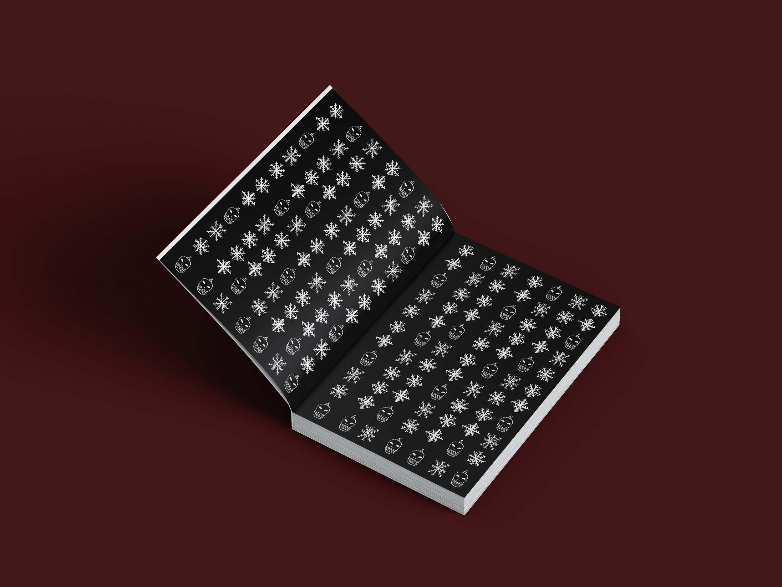
The book's end pages are a pattern I created with alternating skull ornaments and snowflakes. It felt fitting to make this pattern black and white to compliment the theme. The end pages reflect the story and my illustrations of a horror theme while still being slightly playful.