Suckr:
Lipbalm Branding and Packaging
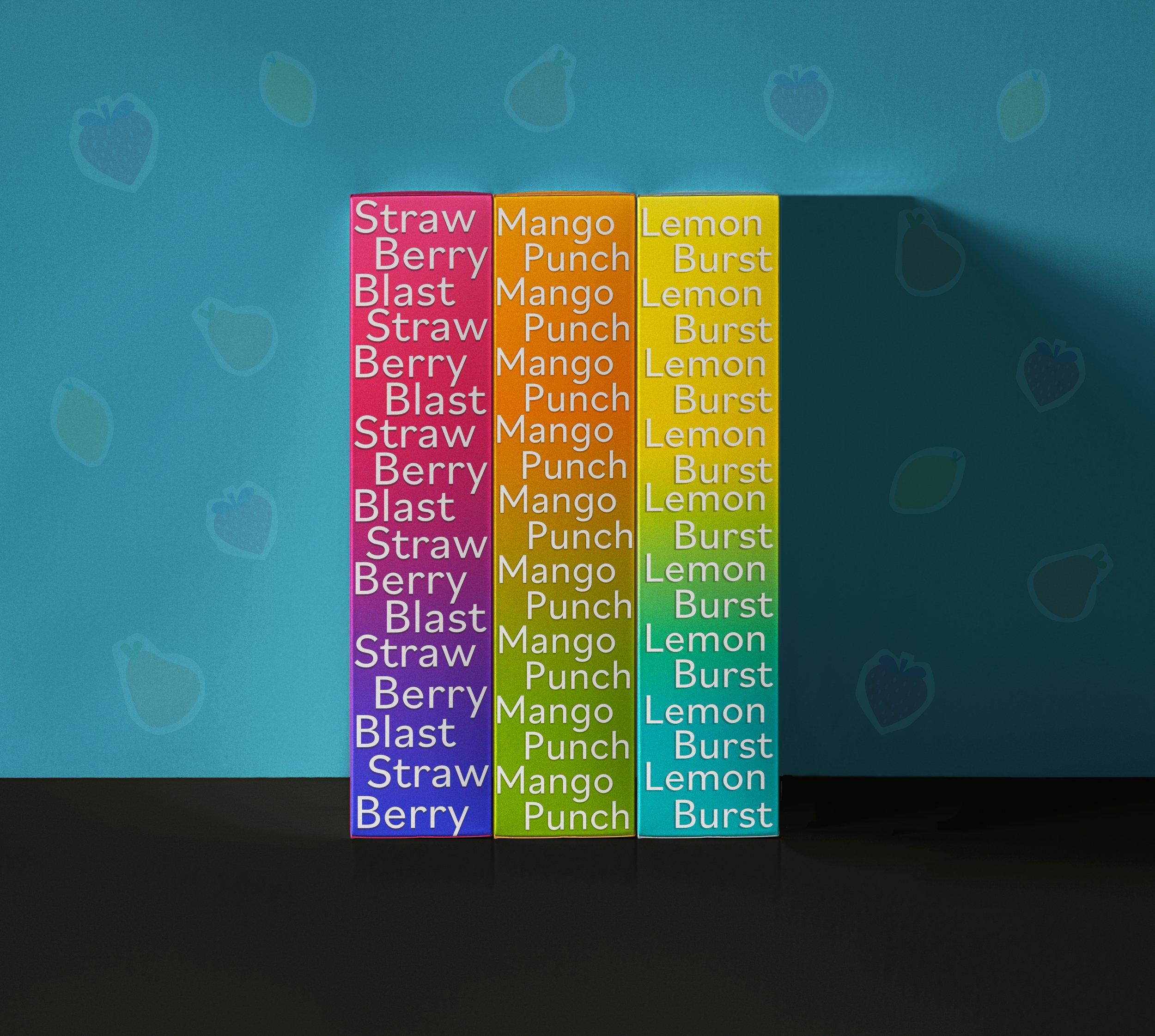
Lip Balm and personal care products often have captivating and vibrant packaging. I love walking around stores and looking at how different brands incorporate new flavors and colors. The idea for SUCKR was to make a brand logo, style, and three different flavors. I researched different lip moisturizers and makeup packages. I was drawn to how many brands contracted simple graphics with bold, bright colors. For my own packaging, I incorporated bright gradients that matched the strawberry, mango, and lemon flavors. I also contrasted the simple type with simple fruit illustrations. I believe SUCKR turned out to be a fun project that matches the personal care packaging trends of 2024.
The front and back of the Stawberry Blast lip balm box
The front and back of the Mango lip balm box
The front and back of the Lemon Blast lip balm box
Lipbalm Product Art
The Strawberry Blast, Mango Punch, and Lemon Burst lip balm sticks and covers. The covers have fruit illustrations that create fun patterns. The idea behind this design is that each lip balm is easy to distinguish even without its box.
Suckr Social Post
Sketches and a moodboard for the branding of Suckr. I did intensive research on makeup packaging and advertising trends.
I created a social media ad for suckr. The ad helped me further establish the style for suckr’s branding. I used the pink and purple from the style guide and played with textures.
